R squared: Maybe it’s not hip, but it’s way cool

R squared is an awesome metric of correlation – which is to say, it’s an awesome way to assess how two quantitative variables might be related. For example, mouse weight and size might be correlated. (This example is pretty obvious – a bigger mouse will probably weigh more than a smaller one, unless the bigger one is just fluff).

Here's the raw data for 7 mice (n=7) with mouse weight on the Y-axis and mouse size on the X-axis.

Here’s the raw data for 7 mice (n=7) with mouse weight on the Y-axis and mouse size on the X-axis.

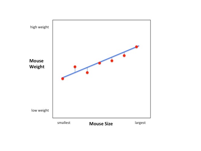
Looking at the raw data for 7 mice (n=7) we see that there is a trend: larger mice tend to weigh more than smaller mice.

The blue line illustrates the correlation between mouse weight and mouse size. Bigger mice tend to weigh more. The blue line illustrates the correlation between mouse weight and mouse size. Bigger mice tend to weigh more.

The blue line illustrates the correlation between mouse weight and mouse size. Bigger mice tend to weigh more.

Can we use this trend to predict a mouse’s weight if we know it’s size? How good is this prediction? R-squared can answer these questions. It is an easy to calculate and easy to interpret metric of correlations (i.e. the relationship between mouse size and mouse weight.) R-squared is the percentage of variation in the data that the relationship accounts for.

What’s the variation in the data? That’s easy, it’s the difference between the individual data points and the mean.

Calculating the variation in the data. It's the squared difference between the distances between the data points and the mean.

Calculating the variation in the data. It’s the squared differences between the data points and the mean.

How do we calculate the variation around the mouse/weight relationship? We just calculate the variation around the blue line that we drew before.
08_calc_var_line

The variation around the line is just the squared differences between the data points and the blue line.

Now to calculate the percentage of variation that mouse/weight relationship accounts for, we just subtract the the variation around the line from the variation around the mean and then divide by the variation around the mean. Here it is in pictures:

In the bottom of the graph we have the formula for R-squared. All we need to know to calculate it is the variation around the mean and the variation around the blue line.

In the bottom of the graph we have the formula for R-squared. All we need to know to calculate it is the variation around the mean and the variation around the blue line.

First, we calculate the variation around the mean.

First, we calculate the variation around the mean.

Second, we subtract the variation around the blue line.

Second, we subtract the variation around the blue line.

Lastly, we divide by the variation around the mean. This means that the numerator will be a percentage of the mean since the variation around the line will never be less than 0 and it will never be greater than the variation around the mean.

Lastly, we divide by the variation around the mean. This implies that the numerator will be a percentage of the variation around mean since the variation around the line will never be less than 0 and it will never be greater than the variation around the mean.

Now let’s use some numbers to calculate a real R-squared!

Slide40

Here is our calculation, all flushed out with numbers.

An Introduction

The first statistics class I took was a disaster. Held in a large auditorium packed with students, its atmosphere was more “refugee camp” than classroom. The general din made it impossible to hear the professor. Attendance was mandatory and, as far as I could tell, the sole factor that determined our final grades. One day a group of students started punching each other, hard. A fight had broken out. That’s right, a fight had broke out in my graduate level statistics class.

I quickly gave up on learning anything from the lectures and turned to the $150 textbook instead. However, it was a collection of random SAS code and ANOVA tables, and the examples didn’t look like anything I had seen before. I re-read the chapter on t-tests 50 times before giving it up as a lost cause. Even basic concepts, like “average”, became confusing. Everything was backwards.

Despite the rough start, I love statistics. Statistics create knowledge. You start with a pile of numbers, you run statistics on them, and out comes information for making the best decisions. That’s cool, right? Making an informed decision is so much more awesome than guessing, especially when it pertains to how to use precious resources, like our time. It’s awesome. Stats are also fun. That’s right, stats are fun. You might now believe me yet, but you will. Trust me.

With this blog, I am going to explain statistics so that you can use them confidently. If you’re in the middle of a statistics jungle, and fights are breaking out around you, I want this blog to be a refuge so that you can learn what you need to learn. The methods can be used in a lot of contexts, but, because I work in a mouse molecular genetics lab, I’m going to explain them primarily within that context. I’ll try to keep things general, so that if this isn’t your specialty you can still follow along, but I wanted something that my co-workers could turn to and understand without having to translate the examples into their own language. Thus, examples will be given in terms of “gene expression” rather than “migrating birds”, or “seismic activity”.